Communicative Focus. Task 9. Hand in your reports written as a home assignment after the last class on Unit 7 to your teacher for checking and grading.
Task 9. Hand in your reports written as a home assignment after the last class on Unit 7 to your teacher for checking and grading. Your teacher will hand out the reports written by you as a home assignment at the next class, checked and commented on. After you look through the comments made by the teacher, ask him/her questions if you do not quite understand or have doubts about some comments.
Task 10. Open your Workbook and check your homework (Tasks 1-3).
Task 11. Read the quotations below and say whether you agree or disagree with them. (You have 10 minutes for this task).
A. This paperback is very interesting, but I find it will never replace a hardcover book - it makes a very poor doorstop. Alfred Hitchcock B. Good book design is silent. Leon Paternoster
Task 12. Role play. Your teacher should divide you in two groups (Group A and Group B). At the previous lesson you learned all the parts of a book. Imagine that you work in a publishing company and a new client came today for consultation. Group A. This client wants to publish a scientific book on crisis management. Group B. This client wants to publish a detective novel. Your task is to tell him/her which parts should be in his book. Which of them are optional and which are mandatory. You should also describe each book part for him/her. You should work according to the following scheme: ü Front Matter ü Text ü Back Matter Each team should choose a presenter to talk to the client (You have 5 minutes to write down a plan for your consultation with your team).
Task 13. It is said that book design is everything that affects the appearance of a book. Look at the covers of four different books and answer the following questions (You have 10 minutes for this task): 1. Which cover book design do you like the most? Explain your answer. 2. Which cover book design do you consider the most thought provoking? 3. Which cover book design do you consider the most unusual? 4. Can you guess what this book would be about by its cover? 5. Predict the genre of these four books by their covers. 6. Which of these books would you like to read? 7. Imagine that you have the chance to change one book cover of these four. Which one would you choose and how would you change it?
A B
C D Task 14. It is said that the job of a book designer is to make a text as easy to read as possible. Book design is the art of incorporating the content, style, format, design, and sequence of the various components of a book into a coherent whole. Now we will read the article about the elements of a good cover design to get to know this job better. Book Design: Elements of Good Cover Design The basic rule of cover design is that the cover should match the contents of the book. That means that the style, format, and message of the cover should be compatible with and support the style, format, and message of the book itself. If you want to have an effective book cover design you should follow one of the following pieces of advice: 1. Use a standard format. The book should look like a book, and especially like other books with similar contents. If you want to attract the attention of buyers of a specific genre, your books must look like other books within the genre. In the case of romance novels, this means a cover with a feminine typeface combined with an illustration of a man and woman caught in a wild embrace. 2. Follow trends. Lately, the covers of romance novels have featured more flesh on the man than the woman. For hardcover romances where the publisher is trying to break the writer out to a wider general audience, the covers tend toward fancy type and flowers – a genteel approach that seems to work. 3. At the same time, the book must look different. It must be able to stand out in the crowd. That is one reason Zebra Books printed holograms on the covers of its romance novels. It hoped to distinguish its line of novels so the books stood out on the paperback racks and thereby attracted more attention from potential buyers. 4. Be bold and simple. The front cover of a book should be bold and simple. The cover should be uncluttered, easy to read (with highly readable type), and simple enough that the casual browser can catch the title and name of the author without searching for either. 5. Put the most important element at the top. Generally speaking, the title of the book should be featured at the top of the cover. It’s the first thing the reader should see. If, however, the author is well-known and more important than the title, then feature the author’s name in bold type at the top of the cover. With bestselling novelists, the author is the brand and, hence, his or her name sits at the top of the book proclaiming the brand. 6. Choose a correct typeface. The typography of the front cover should match the style of the book. For example, a simple typeface is more appropriate for a serious book while a fancy script typeface might be more appropriate for a romance novel. Typefaces come in all sorts of styles from simple to complex, feminine to masculine, romantic to business-like, strong and bold to light and airy. Note: In 99% of books, the typeface should be a display face not a text face. 7. Use illustration where appropriate. Fiction should have an illustrative element on the cover while nonfiction can do without any graphic elements. Indeed, serious nonfiction books may be better served by a simple bold headline and little else. Again, the design of the cover depends on the style and subject of the book as well as the intended audience. (The text is borrowed and modified from http://askthecoverdesigner.com/book-design-elements-of-good-cover-design/: as of 25 March 2012)
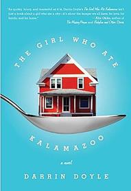
Task 15. Look through the article once more and answer the following questions. Only one variant is possible (You have 5 minutes for this task). 1. According to the author of the article. a) If you want to attract the attention of buyers the book should have another format. b) The book should look like other books with similar contents. c) The book should look like other books with similar contents, but have a slightly different format. 2. Zebra Books printed holograms on the covers of its romance novels…: a) in order to attracted more attention from potential buyers; b) because it was more convenient for booksellers; c) because it was not romantic novels in fact. 3. The front cover of a book should be… a) colourful and easy to read; b) bold, simple and uncluttered; c) casual and consist some picture of the author. 4. The title of the book whose author is not well-known should be placed… a) after the author’s name; b) after the author’s name and the name of the publishing company; c) at the top of the cover. 5. A simple typeface is more appropriate for… a) a serious book; b) a romance novel; c) a detective novel. Task 16. Find the synonyms of the following words in the text (You have 5 minutes for this task): main, impressive, correspond, elegant, graceful, mixed, occasional, differentiate. Task 17. Look through the article again and write out all the words that can be used to describe the book cover below. Do you think that we can find the usage of some principles from the article in this book cover? (You have 10 minutes for this task).
|


